Systems that powerreal business growth.
From SaaS platforms and mobile applications to enterprise systems, every project is engineered for reliability, scalability, and long-term impact.
Web Applications
JG Pharmacy
Purpose
A pharmacy that took orders by phone now runs stock, orders and delivery from one system.
Why it was built
Orders arrived by phone and Facebook, stock lived in a paper register, and expiring inventory was discovered too late.
Technology
Future direction
Built to grow with new Healthcare workflows, deeper automation, third-party integrations, and richer analytics as usage expands.
Mobile Applications
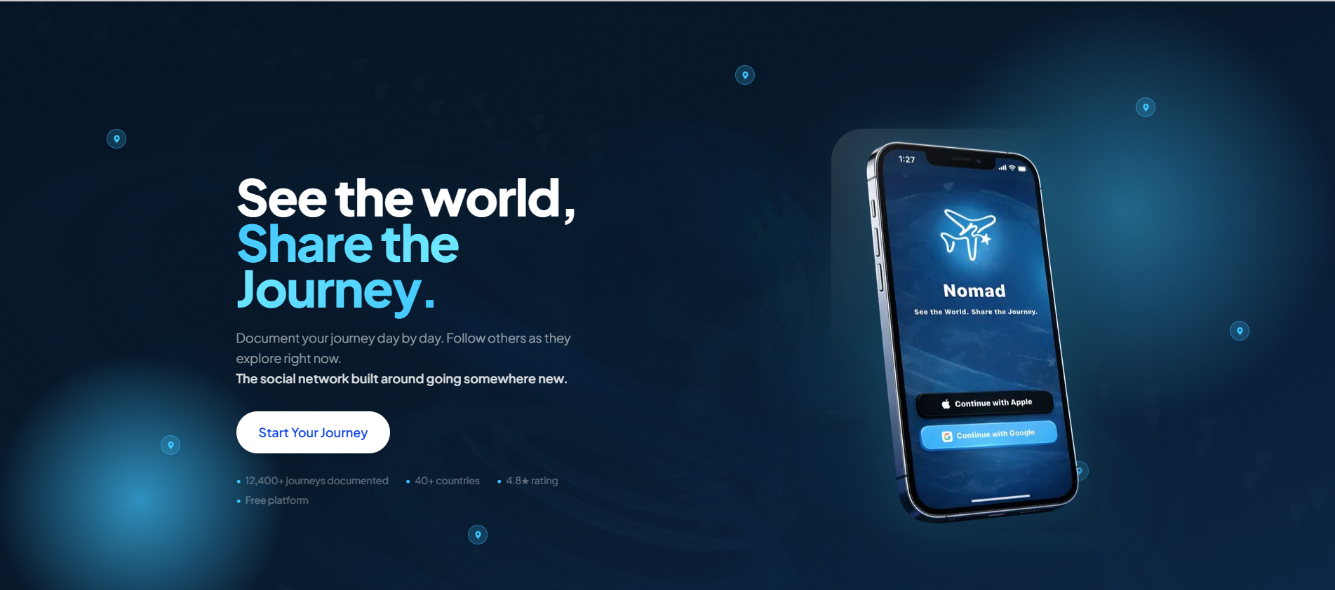
Nomad Travel App
From WhatsApp trip planning to a booking system travelers carry in their pocket.
Digital Experience Websites
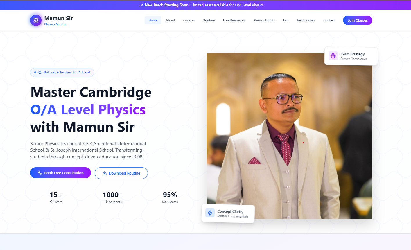
Mamun Physics
A construction firm's credibility, projects and inbound pipeline in one platform.
<!DOCTYPE html>
<html lang="en">
  <head>
    <meta charset="UTF-8" />
    <meta name="viewport"
      content="width=device-width, initial-scale=1.0" />
    <title>Digital Experience</title>
  </head>
  <body>
    <main class="experience">
      <section class="hero">
        <span class="eyebrow">Creative Studio</span>
        <h1>Design that feels alive.</h1>
        <p>Fast, responsive and built to convert.</p>
        <a href="#projects">Explore projects</a>
      </section>
    </main>
  </body>
</html>
<header class="site-header">
  <a class="logo" href="/">Studio.</a>

  <nav aria-label="Primary navigation">
    <a href="#work">Work</a>
    <a href="#services">Services</a>
    <a href="#about">About</a>
  </nav>

  <a class="button" href="#contact">
    Start a project
  </a>
</header>

<main>
  <section class="hero">
    <p>Digital products and experiences</p>
    <h1>We turn ideas into impact.</h1>
  </section>
</main>
<section class="project-grid" id="projects">
  <article class="project-card">
    <img
      src="/images/project-one.jpg"
      alt="Project interface preview"
    />

    <div class="project-card__content">
      <span>Web Design</span>
      <h2>Modern digital experience</h2>
      <p>
        A responsive website focused on clarity,
        motion and meaningful interaction.
      </p>

      <a href="/projects/project-one">
        View case study
      </a>
    </div>
  </article>
</section>
<!DOCTYPE html>
<html lang="en">
  <head>
    <meta charset="UTF-8" />
    <meta name="viewport"
      content="width=device-width, initial-scale=1.0" />
    <title>Digital Experience</title>
  </head>
  <body>
    <main class="experience">
      <section class="hero">
        <span class="eyebrow">Creative Studio</span>
        <h1>Design that feels alive.</h1>
        <p>Fast, responsive and built to convert.</p>
        <a href="#projects">Explore projects</a>
      </section>
    </main>
  </body>
</html>
<header class="site-header">
  <a class="logo" href="/">Studio.</a>

  <nav aria-label="Primary navigation">
    <a href="#work">Work</a>
    <a href="#services">Services</a>
    <a href="#about">About</a>
  </nav>

  <a class="button" href="#contact">
    Start a project
  </a>
</header>

<main>
  <section class="hero">
    <p>Digital products and experiences</p>
    <h1>We turn ideas into impact.</h1>
  </section>
</main>
<section class="project-grid" id="projects">
  <article class="project-card">
    <img
      src="/images/project-one.jpg"
      alt="Project interface preview"
    />

    <div class="project-card__content">
      <span>Web Design</span>
      <h2>Modern digital experience</h2>
      <p>
        A responsive website focused on clarity,
        motion and meaningful interaction.
      </p>

      <a href="/projects/project-one">
        View case study
      </a>
    </div>
  </article>
</section>
<!DOCTYPE html>
<html lang="en">
  <head>
    <meta charset="UTF-8" />
    <meta name="viewport"
      content="width=device-width, initial-scale=1.0" />
    <title>Digital Experience</title>
  </head>
  <body>
    <main class="experience">
      <section class="hero">
        <span class="eyebrow">Creative Studio</span>
        <h1>Design that feels alive.</h1>
        <p>Fast, responsive and built to convert.</p>
        <a href="#projects">Explore projects</a>
      </section>
    </main>
  </body>
</html>
<header class="site-header">
  <a class="logo" href="/">Studio.</a>

  <nav aria-label="Primary navigation">
    <a href="#work">Work</a>
    <a href="#services">Services</a>
    <a href="#about">About</a>
  </nav>

  <a class="button" href="#contact">
    Start a project
  </a>
</header>

<main>
  <section class="hero">
    <p>Digital products and experiences</p>
    <h1>We turn ideas into impact.</h1>
  </section>
</main>
<section class="project-grid" id="projects">
  <article class="project-card">
    <img
      src="/images/project-one.jpg"
      alt="Project interface preview"
    />

    <div class="project-card__content">
      <span>Web Design</span>
      <h2>Modern digital experience</h2>
      <p>
        A responsive website focused on clarity,
        motion and meaningful interaction.
      </p>

      <a href="/projects/project-one">
        View case study
      </a>
    </div>
  </article>
</section>
<!DOCTYPE html>
<html lang="en">
  <head>
    <meta charset="UTF-8" />
    <meta name="viewport"
      content="width=device-width, initial-scale=1.0" />
    <title>Digital Experience</title>
  </head>
  <body>
    <main class="experience">
      <section class="hero">
        <span class="eyebrow">Creative Studio</span>
        <h1>Design that feels alive.</h1>
        <p>Fast, responsive and built to convert.</p>
        <a href="#projects">Explore projects</a>
      </section>
    </main>
  </body>
</html>
<header class="site-header">
  <a class="logo" href="/">Studio.</a>

  <nav aria-label="Primary navigation">
    <a href="#work">Work</a>
    <a href="#services">Services</a>
    <a href="#about">About</a>
  </nav>

  <a class="button" href="#contact">
    Start a project
  </a>
</header>

<main>
  <section class="hero">
    <p>Digital products and experiences</p>
    <h1>We turn ideas into impact.</h1>
  </section>
</main>
<section class="project-grid" id="projects">
  <article class="project-card">
    <img
      src="/images/project-one.jpg"
      alt="Project interface preview"
    />

    <div class="project-card__content">
      <span>Web Design</span>
      <h2>Modern digital experience</h2>
      <p>
        A responsive website focused on clarity,
        motion and meaningful interaction.
      </p>

      <a href="/projects/project-one">
        View case study
      </a>
    </div>
  </article>
</section>
Dashboards &Business Systems
Nomad Travel App
From WhatsApp trip planning to a booking system travelers carry in their pocket.
Build the next success story
Your business could be our next featured project.
Tell us what is manual, scattered, or slowing your business down. We will design the system that replaces it.